
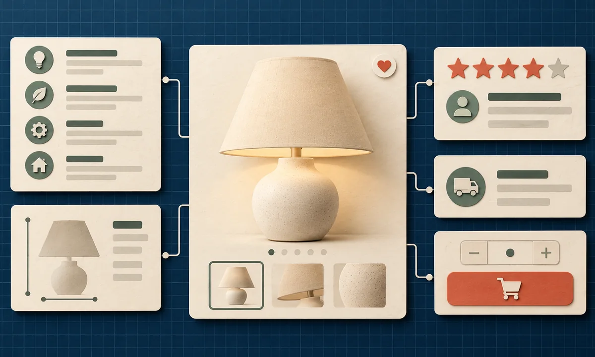
A product page has one job: help the right buyer decide with confidence. It is not a warehouse shelf label. If the customer must open five tabs to learn the size, delivery date, or return policy, the page is asking them to do your work.
Plan the information in the order a buyer needs it.
Start with the decision, not the theme
At the top of the page, show a clear product name, a useful image, price, availability, important variation choices, and the primary purchase action. Then answer the first objections: What is it made of? Who is it for? How large is it? What is included? When can it arrive? What if it is wrong?
This is not a demand to cram every detail above the fold. It is a requirement to make the next answer easy to find. A good WordPress content plan defines these fields before a theme is chosen, and a custom theme brief protects them in the layout.
Baymard Institute's 2026 product-page benchmark rated 62% of mobile ecommerce sites and 52% of desktop sites as having mediocre-or-worse product-page UX. The benchmark covers major ecommerce sites, not only WooCommerce stores. Its lesson is that polish alone does not answer customer questions.
Build a reusable product evidence block
Create a short description that explains the benefit in plain language, then a structured specifications area for facts. Add dimensions, materials, compatibility, care, warranty, and what's in the box where relevant. Use original photos that show scale and important details. If a comparison would prevent a return, include it.
WooCommerce's product documentation supports simple, variable, grouped, and external products. For variants, make price and availability update clearly when the buyer changes size or color. Global attributes help keep values such as size consistent across the catalog and enable filtering. Do not hide important distinctions inside a generic paragraph.
Proof should be specific. A review that says “works well in a small kitchen” answers more than five anonymous stars. Explain whether reviews are verified, show both strengths and limitations, and avoid publishing claims you cannot substantiate. A technical product may need a compatibility table; a fashion product may need model measurements.
Remove the surprises before checkout
Baymard's cart-abandonment research aggregates 50 studies into an average abandonment rate of 70.22%. That figure includes window shopping and many causes, so it does not mean your product page is responsible for every abandoned cart. It does show why ambiguity before checkout is expensive.
In Baymard's separate survey of reasons, 40% of respondents who abandoned for a stated reason beyond browsing cited extra costs being too high, while 12% said they could not see or calculate the total up front. Show delivery estimates, fees, taxes where possible, and the return policy before the buyer commits. Then map the checkout path to ensure the promise holds through payment.
Check the page on a phone
Most teams review the desktop design and assume the mobile layout is fine. Test a real product with a long name, multiple variants, a sold-out option, and several images. Can the buyer select the right option without accidental taps? Does the purchase button remain clear? Does opening an accordion hide the information they need?
The 2025 HTTP Archive performance report found only 48% of mobile websites met all Core Web Vitals thresholds. Compress images, reserve their space, and keep third-party widgets under control. A slow product page makes every other improvement work harder.
Finally, ask someone unfamiliar with the catalog to complete a task: choose the right variant and explain the full cost. Note where they hesitate. Fix that point first. If you want a broader store comparison, our Shopify inspiration roundup shows useful merchandising patterns across different product types.
Set a review schedule for the catalog. A product page can become inaccurate when materials, packaging, stock, or delivery terms change. Give each important field an owner and a last-checked date. If customers repeatedly ask the same pre-purchase question, answer it on the page and note whether support requests fall. That feedback loop makes the structure useful long after launch.
A useful product page is a decision tool. It combines the right facts, credible proof, and a checkout path with no nasty surprises.